Mobile devices have become increasingly popular. On many websites, traffic from mobile devices, including mobile browsers, WeChat, and mobile apps, already far exceeds traffic from desktop devices. Some sites have even skipped the desktop version entirely and built only a mobile version. In this article, we will discuss practical ways to develop a WordPress mobile theme.
First, choose a mobile front-end framework
Because mobile devices vary so much, building a WordPress mobile theme entirely from scratch means adapting to different resolutions and different screen sizes, which can create a very large workload. With the rapid development of front-end tooling, we already have many mature front-end frameworks we can rely on.
In this article, we will use Ratchet, the mobile front-end framework released by the Bootstrap team, as an example to explain a practical workflow for WordPress mobile theme development.
Build the HTML pages from the design mockups
Before starting WordPress theme development, we normally already have the designer’s mockups. Based on those mockups, we can build the HTML pages with the corresponding Ratchet components. Ratchet provides both Android and iOS skins by default, but in most cases the default skins will not fully match the project requirements. We usually need to create a new skin based on the colors and design patterns provided by the designer. Ratchet is built on Less and exposes a rich set of variables, so we can customize a roughly suitable skin simply by changing those variable values. To keep this article focused, I will not go deeper into that part here.
Use the Underscore theme framework
Once the HTML is ready, we need to turn that HTML into a WordPress template. Since mature WordPress starter frameworks already exist, the easiest approach is to choose one you like and combine your HTML with it. In this article, we use the Underscore theme framework as the example. We only need to enqueue the CSS and JavaScript files into the theme. In Underscore, those assets are defined in functions.php, so we can directly modify that file as needed.
Copy the HTML and replace the hard-coded content with WordPress fields
Take a list page as an example. We can create a custom query and place the WordPress loop into the corresponding HTML structure. As shown below, the code in the HTML page we built looked like this.
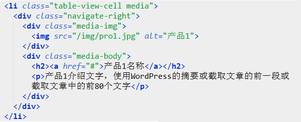
At this point, we only need to replace the image, link, and text in that markup with content pulled from WordPress. This is the most important step, and it is also the step many WordPress beginners find most difficult. The following screenshot shows the code after that replacement.
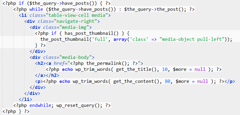
If you compare the before and after versions, the HTML structure is exactly the same. The main difference is simply that the hard-coded content has been replaced with content pulled from the WordPress database.
This article introduced the general idea of building a WordPress mobile theme with the Ratchet mobile front-end framework. Of course, you can use other front-end frameworks to build a WordPress mobile theme, or if you are highly experienced in front-end work, you can build the theme without using a framework at all. Regardless of whether a framework is used, the overall development approach to a WordPress mobile theme remains the same. If you have better ideas or different opinions, feel free to discuss them in the comments.